Showing posts with label Making Sausage. Show all posts

Tuesday, December 23, 2014

Happy holidays

Whatever it is you celebrate, if anything, I hope it's a good time.

This is an image I made, with some process pix along with it.


The piece started as a pencil drawing with intentional smudges. I scanned the drawing and with Photoshop turned the smudges into a half tone pattern.
I added the skin tone and hair as layers. They are scanned watercolor washes.


I added the color of the wing and the bird, also scanned watercolor washes. The robe texture was a photograph of a wall, as was the background. The clock is from a photograph of the court house in beautiful Crockett, Texas.
The gold leaves seen in the final version were from a photograph of a pattern on an antique window.
This piece exists only in digital form.


These are the textures I used, from photographs I took and watercolor washes I made.

Friday, May 31, 2013

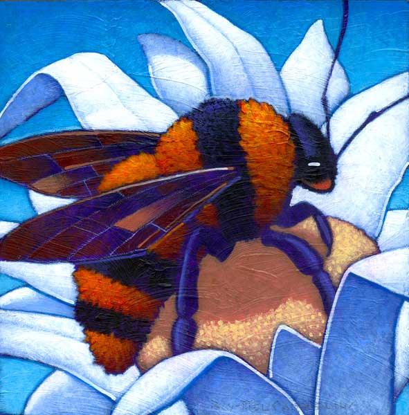
A bumblebee process


"A Bumblebee", 6 by 6 inches, acrylic on panel.

I decided to document the process of this small painting with still pictures. Maybe some day I'll have the smarts to make a video and speed it up or something. Anyway, here's how it works.


This is a gessoed panel, with wood sides. For this series I'm using these as ground, instead of my usual stretched canvas.


Here I've taped the edges to protect them from stray paint. The surface is covered with a base texture I have brushed on using matte gel. I like the brushy undercoat it gives to the surface.


A base color, usually purple or a mix of purple, red and brown, is applied.


And here's the base color complete. I like the uneven look, even though most of it ends up being covered. There was a time when I thought the base color had to be perfectly flat, but I've gotten over that.


Using a white pastel pencil I execute a rough drawing of the subject; in this case a large bumblebe on a flower. Pastel pencils easily erase or wash off, to eliminate the underdrawing.


I'm starting to paint the bee, working from the darkest value to the lightest.


These yellow highlights will be the lightest value on this striped section of the bee.


Here's the bee form with both orange and black stripes complete.


After painting the stained-glass look of the wings I'm using a white prismacolor pencil to detail the "veins", for lack of a better, probably more accurate term, of the wings. Prismacolor, unlike pastel, pencil marks are very hard to erase. Nor do they smudge.


The flower petals are going to be white. This blue serves as their base and shadow value.


After a couple of values are added, the white petals come into form.


The center of the flower has a pale yellow hue.


And there it is, needing only my signature.


Here it is hanging on the wall.

This is one of the paintings for "Inside and Out", my September show at Norwood Flynn Gallery in Dallas.

Friday, December 28, 2012


"Flowers and Fruit", acrylic on canvas, 11 by 14 inches.

This painting is a continuation of realizing a drawing made a few years ago as a proposal for a painting in a children's hospital. The commission didn't work out, but I liked the drawing well enough to pursue it.

Here it is below.


Below is the first exploration, in the "Neo-Retro" style, using a mix of "traditional" and digital media.


The original proposal called for the painting to be four by six feet with three dimensional elements breaking out of the sides and top. This one is considerably smaller, with no 3-D, and I think probably works out a lot better anyway.

Click on all the images to see them bigger.

Thursday, July 12, 2012

"Sunflower"


A couple of people (Yes! A whole couple) have mentioned that they like to see posts on my process of a painting. So here is an example for an "Americana" painting I'm leaning toward calling "Sunflower". I paint from dark to light, with a mix of purple, red oxide and cadmium red dark as the base. The drawing is in white pastel pencil. The different layers of color are opaque. Sometimes if I decide I want a color darker than it turned out, I'll give it a wash of a darkening color.
I'll post the finish soon.

Tuesday, June 19, 2012

"Francis" in progress


I've decided to pick up again on the "Americana" series with this painting, "Francis", pictured here on my small easel. The sky needs to be completed, then it's finished.

The original title was going to be "Feathered Friends", but I became concerned about that sounding unnecessarily cornball. So now the title is a play on St. Francis, the patron saint of birds. These birds are all natives of New Mexico.

Of course, I'll post the finished version next.

Wednesday, August 17, 2011

"Birds and Budding Flower"

Yesterday I delivered "Birds and Budding Flower", acrylic on canvas, 36 by 36 inches. It's to be installed at the new Scott and White Children's Hospital in Temple, Texas, which opens in October.

This was the preliminary sketch. Below are photos of the piece in progress.

Here I've used a grid system to enlarge the sketch and draw it onto the canvas.

Some of these photos are not particularly good, sorry. In this one I've begun my usual dark-to-light painting technique to build the forms. I've changed and simplified the stamens.

More progress on the flower.

The birds and the stem and leaves are completed, and I've started on the background. I always paint from the front subject to the back.

I was concerned the background was a little to dark for a children's hospital setting, so I added some clouds at the top to lighten everything. Here the finished painting sits on my easel.

When the hospital opens I'll visit the site and post a photo of the piece (and probably me beside it) in its new home.

Friday, June 3, 2011

Shadows

From an old book, Fun with a Pencil by Andrew Loomis, I learned how to create accurate shadows for invented scenes without photo reference. I teach the technique in one of my illustration classes, sometimes to the chagrin of students who try to make it way more complicated than it is.

I used the system in this early illustration for a magazine article on private chess clubs in New York City. Above each table is its own light source. The sconces on the wall woudn't provide enough light to interfere with the lights above the chessboards.

I've used this method a lot, but not all the time. As I tell the students, it's good to know it even if one doesn't use it.

Monday, September 27, 2010

Business card

In thirty years of doing this thing professionally, I've never had a business card. Larger, 8.5 by 11 inches, promotional pieces and post cards, but no regular size business cards. So now I do.

This is one side. The idea is to turn the card over vertically and there's my name and contact info.

So this is the back. Sorry, I fuzzed out my phone numbers. If you're reading this and don't have that information, use the e-mail address. It's what I prefer anyway.

Turning over the card completes the image of the painting.
Next time you see me, tell me to give you one.

Wednesday, September 22, 2010

"Patches" and "Drops"

This is a recent rooster painting, "Eli". It's 18 by 14 inches and is the usual acrylic on canvas. A recent discussion about it brought up something I should address. That's the use of "patches" and "drops" on some of these pieces. Seeing the paintings in photographs without experiencing them "in person" (and sometimes then) can lead to confusion about what these things are and why they are there. So here's the explanation.
First, the "patches". They aren't literally "patches". I use that term because someone once, when I first began to use them, asked me if that's what they were; I suppose the questioner assumed they were covering some a mistake or something. No, if I make a mistake big enough that the only way to fix it is to cover it up with a piece of paper, then I just discard that work and start over. The function of the "patch" is more esoteric than that.
It is usually a piece of Arches watercolor paper, sometimes 300 lb to 140 lb, attached to the canvas before painting begins. The intention is to add a dimensional element as well as a geometric rectangular design device which provides contrast to the more "organic" freeform elements of the rooster's or the landscape's forms. It's also a subtle frame for some parts of the painting, usually the rooster's head area. Finally, it gives a texture that's different from the canvas texture, adding some variety to that visual experience.
"Drops" are just that, drops of paint, usually thick enough to have a dimensional quality of their own, which add circular geometric elements to the mix. On other pieces I've used circular marks for the same purpose.
These are design devices that make the work more interesting to me in the process. Some viewers like the effects, some prefer the imagery to be more "conservatively", for lack of a better word, represented. I add these elements when the spirit, if that's what it is, moves me.
Here are some other examples (click on any image to see it a little larger).

This is a rooster painting that has neither "patches" or "drops".

This landscape features a "patch" framing the red leaf tree in the lower center foreground.

"Afternoon Hill" is "patch" free.

A prominent "patch" shows up in this cow painting, while the one below goes patchless.

Monday, June 7, 2010

Drawing Inspiration

I'm quoted and a few of my pictures are featured in this new book by writer/artist Michael Fleishman.
It's available on Amazon at this link.
This cover illustration is by David Bowers.

Friday, April 30, 2010

Crested Butte


Late last year I posted the process of painting this picture, "Crested Butte", as a private commission. I just now have the "official" professional photograph of it, instead of the one made with my camera.
The painting is acrylic on canvas, 30 by 40 inches, and hangs, or will soon, in the clients' home in Crested Butte, Colorado.

Monday, April 19, 2010

Mystery Project - Part Six


Here's the finished painting for this project. Again, it's taken with my point-and-shoot camera, so the quality of photography leaves a lot to be desired. My next step is to get a good record of the piece.
This hasn't cleared with the client yet, so I'm not going to reveal that information until the coast is clear.
One never knows. I'm pretty optimistic, though.

Thursday, March 25, 2010

Mystery Project - Part Five

Getting there...

One more land form in the background and the sky is still to come.

This is a detail showing the stand of trees in the background. I'm going for a jolly grandfatherly look with these guys.

Thursday, March 11, 2010

Mystery Project - Part Four

This update shows the foreground taking form more clearly than has been the case before. I'm putting in the grass color, which will go back just past the elephant, with a lighter version of that color continuing on the slopes behind him.
He's pink, obviously, and is spraying a rainbow into the little pond. I painted his reflection several times before I got a version I was comfortable with. The foreground cows are completed, as is the flying bee on the right. He's not reading clearly yet, since he's still against a dark background, which will be lightened considerably soon.
Below are a few details illustrating the transtion of tonal values as I paint from dark to light.